How To Create The Star Of Your Art:
Part 2

Does the star of your art add glamour or barely a glimmer to your work?
Does your art reach out and grab the viewer’s attention or does it act like a shy teenager and disappear quietly into the background?
If you never intend to show your work outside of your immediate family, these questions may not matter to you.
If, however, you have dreams of sharing your work with the world, or, at least, a local portion of it, knowing how to create the attention-grabbing star of your art becomes much more important.
In my previous blog post I showed you three ways to grab your viewers attention and guide them to your star - using size, details and value contrast.
(If your cat accidently deleted that post when it sat on your keyboard, you can still read it by clicking here.
In this post I'm going to show you three more ways to not only define your star but...
Also make it interesting.
Create The Star Of Your Art With Color Contrast
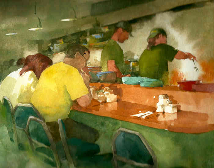
Notice what I did in this watercolor.
The overall color scheme of the art is green, so I attract your attention with the man’s yellow shirt.
Color contrast in action. Then I send your eyes to the real star of my picture – the cook!
Your eyes go to the cook because I’ve done several things to accomplish that.
First, I’ve used more color contrast by painting turquoise dishes immediately in front of the cook and...
Second, I’ve used dark values in his head, shirt and arm that contrast with the very light value behind him.
All of these things work together to draw your attention to him.
Create The Star Of Your Art Using Shape Contrast
In my sketch of this scene from Galway, Ireland look how the man-made shape of the bridge draws your eyes.
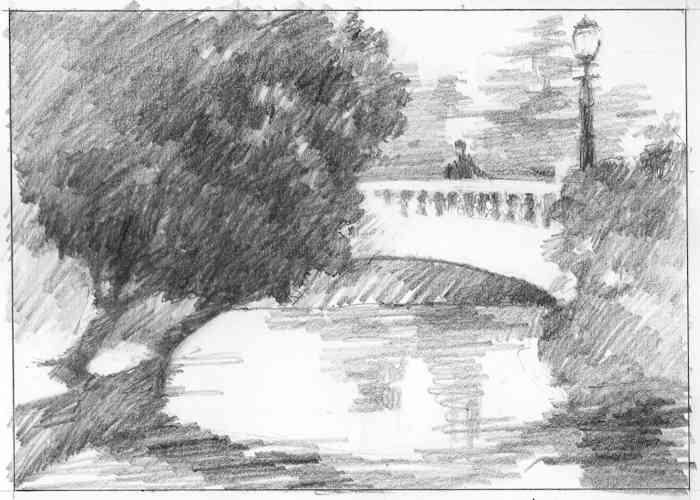
The bridge’s man-made shape contrasts with all the organic shapes of the plant life around it.
And like all the previous examples, I’ve also used value contrast to attract your eyes to my star - the person on the bridge.
I’ve put darker values around the light value of the bridge and...
...I’ve made the man, the star of the art, a dark value against a lighter value background.
But, there’s one other subtle element at work here.
Can you see what it is?
Create The Star Of Your Art Using Texture Contrast
Notice the textural difference between the completely smooth bridge and the strokes of pencil I used in the things around it.
The man is also a smooth shape set against the pencil strokes for the background.
And this isn’t the first time I’ve shown you texture contrast.
You saw it in this drawing in the previous blog post.
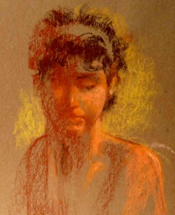
I just didn’t talk about it in that post.
What I did was let the rough texture of the paper show in the unfinished parts of this model’s body and face.
That rough texture creates contrast with the more smoothly finished part of her face.
And the finished part contains the recognizable details of her features.
Best Wishes,
Gary Gumble
Founder of BeginningArtist.com
Without art the crudeness of reality would make the world unbearable. (George Bernard Shaw)
P.S. I hope you’ve noticed something in all the examples I’ve used.
You seldom create the star of your art using only one of the ways I’ve shown you.
Your art becomes much more interesting when you get several ways working together.
That adds variety to your work, and the human eye loves to see variety.
Copyright Gary Gumble 2023 All rights reserved About Privacy Policy Terms of Use Contact www.beginningartist.com 27 rue Roucher, 34000 Montpellier, France