The Art of Painting On The Road
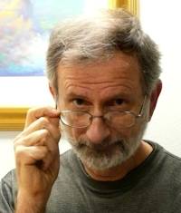
In the planning stage the art of painting on the road didn’t seem very complicated.
My wife and I had decided to spend the first three months of a year-long trip in Europe. France, Spain, and Portugal, looking for the place we wanted to live next.
Then I had a great idea. I’d bring my camera and a bunch of my art supplies. About thirty-five pounds worth as it turned out. But hey, I just knew I’d be inspired to draw or paint a lot of what I saw.
And indeed, almost daily I bumped into sights that cried out: “Paint me”.
Like this waterfront scene in Cascais, Portugal.
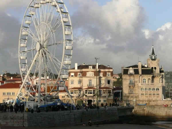
I photographed everything, of course, but paint?... not at all.
There always seemed to be one more plaza to discover. One more restaurant, café or bistro to just sit and sample. Europe was like being a kid in a candy store. I just couldn’t summon enough incentive to sit in any one place long enough to paint it.
Even after lugging thirty-five pounds of art supplies through two countries. Up and down four and five flights of stairs in centuries-old buildings with no elevator.
The art of painting on the road
Who knew the incentive to paint would finally arrive with a monsoon?
Lisbon, Portugal, early January, it was raining cats and cows.
I’d been to the grocery store earlier. And my shoes were soaked from dancing in puddles as I swerved to avoid people with umbrellas.
Time to get comfortable inside, haul out my watercolors and pull up this photograph on my laptop.
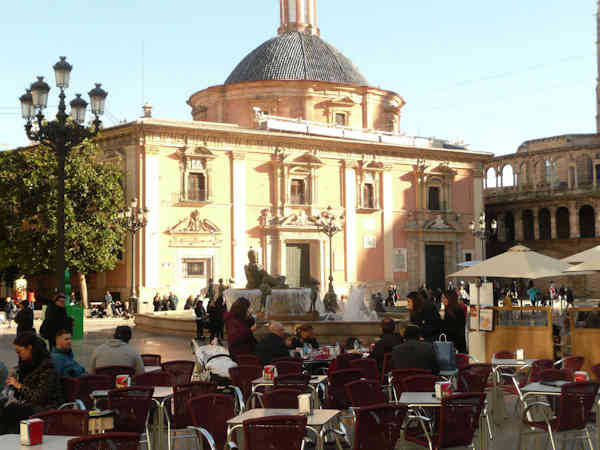
Now, it should be obvious there is a whole lot of “stuff” in this photograph. Lots of “stuff” is what makes painting difficult.
By “stuff” I’m not only referring to all the people, chairs and tables. There is also a lot of detail in the buildings.
The Big Problem with any photograph
In almost every photograph, there are a lot of details. Does painting all those details make more interesting art?
Not usually.
Nor does including a lot of details make art easier and more fun to do.
The Big Question then becomes how do I simplify this scene? Meaning which “stuff” should I keep...
Which stuff should I change...
And which stuff should I eliminate entirely?
And how do you decide?
I’ll tackle that question in just a second but first...
The second Big Problem with this photograph
Depending on the time of day and the settings you’ve chosen on your camera...
Your camera may see colors much differently than you do. In my photograph the sunlit part of the Cathedral of the Virgen in Valencia, Spain has a warm yellowish tone.
In fact, the façade was pinkish stone with lighter columns dividing it.
So, do I paint the colors I saw or the ones the camera saw?
In this case, I chose my memory over what the camera saw.
Something you need to remember here. Whether you are painting plein air or from a photograph, it often doesn’t matter if you exactly match the colors you see.
It only matters whether the resulting art is interesting. And you had fun doing it.
The mistake that made my art better
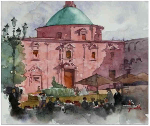
The art you see above is the second version I painted. In the first version I committed a very common mistake.
I stuck too closely to what the photograph showed - I didn’t simplify enough.
Notice the building has lighter vertical columns dividing its façade.

In my first art attempt I made the mistake of showing all those lighter columns. In the art they were distracting. Instead, I should have asked myself in the beginning whether they were important enough to show.
As a result of my error, the first painting answered that question for me.
It was a resounding NO.
That first painting convinced me to simplify further and paint the building all one color.
From there I circled around the photograph deciding which things to keep, toss or change.
● I liked the streetlight on the left and the dark tree behind it. (I decided to keep them but move them to the right a bit.)
You don’t need to see the side of the building.
● I liked the dark columns of the building on the right. (Okay, combine that area with the shadow and only show a few simple columns.)
Too much detail in this area could be distracting.
● I liked the fountain. (Keep it but keep it simple.)
● The foreground is a major mess. Empty café chairs and tables. Barely discernable jumbles of people. (What the art needed was a simplified and interesting arrangement of those elements. This would join the tree and streetlight on the left with the building on the right.)
To build that interesting arrangement I chose a few of the people already in the photograph.
By moving them a bit, changing their size and adding bits of imagination, they gradually formed a simpler, more interesting foreground.
And just for fun, I decided to keep the foreground paint loose and washy. I felt that would create an interesting contrast with the more detailed building.
In the end the common painting mistake I made in my first try made this second attempt better art.
One more detail for those interested in the art of painting on the road, this painting was done on Canson 8 x 10 watercolor artboard.
Sturdy. No stretching needed. No warping worries.
Best Wishes,
Gary Gumble
Founder of BeginningArtist.com
Without art the crudeness of reality would make the world unbearable. (George Bernard Shaw)
Copyright Gary Gumble 2023 All rights reserved About Privacy Policy Terms of Use Contact www.beginningartist.com 27 rue Roucher, 34000 Montpellier, France