The Art of David Grove
While there is a lot of art I like, there is very little that can elicit a "Wow" from me. The acrylic and gouache paintings of David Grove almost always can.
I have been continually amazed and inspired by David Grove's work since first seeing it in Communication Arts magazine many years ago.
Let's see if his art has the same effect on you.
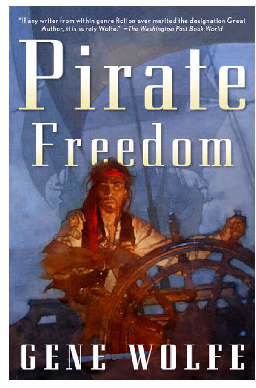
Below is a book cover David painted in the last years of his life. I have no idea how he combined acrylic and gouache to get the images he did.

What I do know is that it takes imagination and a good deal of thought to do what he did not only in this painting, but in all his art.
Everything in the image is simplified and reduced to only what is absolutely necessary to tell the story and create the feeling he wanted to convey.
Look at the ship behind the man. It is mostly a few subtle shapes of color with a few strategically placed highlights.
Yet you know exactly what it is.
Look how he establishes the pirate's face as the star of this picture. He puts the most intense color in the painting in the bandana around the pirate's head. And he uses the pirate's vest as the area of greatest contrast, so it will draw your eyes to the face.
He doesn't waste time perfectly defining the bandana, he shows you the highlight of color and lets you imagine the rest. He doesn't waste time showing you the pirate's other eye. You know it's there.
There is mystery and visual surprise at work everywhere, because he doesn't show you every little detail. That grabs your imagination and gets it involved in the painting.
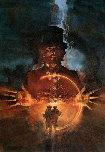
Something Wicked This Way Comes
Below is the movie poster David Grove did for this movie starring Clint Eastwood.
Another striking image, very imaginative in its conception and
design.
And here again all the elements in the art have been simplified and reduced to no more than he needs to grab your attention and pull you into its feeling of mystery and danger!
Like every movie poster should.
Now, you may be thinking that yes, these paintings are very nice, but am I likely to ever do a book cover or a movie poster?
If that thought crossed your mind, it's the wrong question to ask. The right questions are:
1. How can I use some of David Grove's ideas in my own work? 2. How can I bring more mystery, more visual surprise, more feeling to my work?

It doesn't matter whether you use acrylic and gouache, oil, watercolor, or stale coffee grounds to paint.
You can use ideas from David's art.
You could be bold and do a dark washy sky to give the feeling of storm and power.
You could focus the viewer's attention on the star of your picture by keeping the area around it simple.
Look how David Grove made your eyes go first to the man's face, the star of this picture.
Out of the dark background he created a lighter area to mostly silhouette the man's head and shoulders. This area has the strongest contrast in the painting
Strong contrast grabs your attention.
But, he went further. He used dramatic lighting and strong contrast in part of the man's face to focus your attention there. To help with that he kept areas around the face (his hair, hat and coat) as dark simple shapes, devoid of detail.
These are techniques that can be used in any kind of painting, any subject.
And take special notice of how he handles composition.
David Grove - Masterful Design
In the paintings above and the ones below, study his masterful use of design.
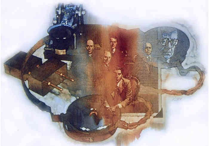
This is David’s cover illustration for the paperback edition of John Le Carré’s “Smiley’s People.” In it, David took disparate elements from the story and woven them into a concise image.

Being this simple and concise is not easy. The world is a very complex place, and we often bring that complexity to our art...
By showing so many unnecessary details.
That’s why David Grove's work is such a revelation. It all looks so easy...
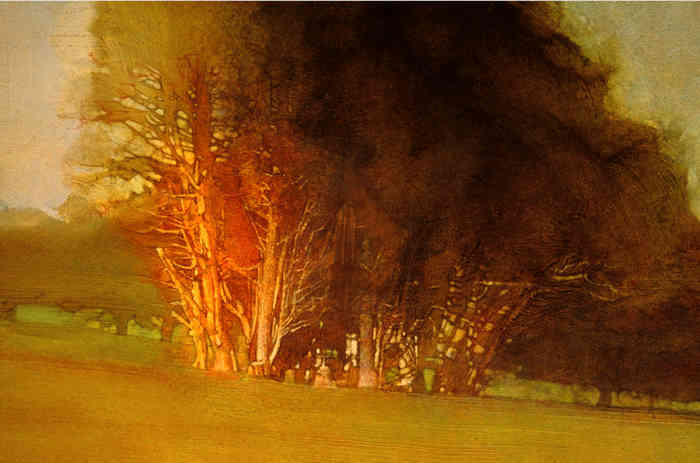
...until you try to emulate it and find that being simple takes thought and effort. Even with simpler subjects like his painting “Lincoln Park” below.

The foreground grass and background trees are done very simply, like they were created with a couple quick strokes of paint.
Even the foliage of the trees in the center have a watercolor feel.
And notice how on the left side of this group of trees he used some reddish color to help draw your eyes to the sunlit tree trunks. Visual surprise!
Look at how the trunks have a three-dimensional quality to them, but as they rise into the foliage they become a flat olive-colored wash with a few sky holes.
At their most basic all paintings are about using your imagination to create a good idea, and using design, drawing, color and value to create something striking.
If you want to do that well, you can only be helped by studying these acrylic and gouache paintings by Hall of Fame illustrator David Grove.
Want to see more about David Grove and his work? Here is a link to discover more about this fascinating artist:
https://www.muddycolors.com/2011/06/david-grove-hall-of-fame-illustrator/
Go from The Art of David Grove to Art Tips and Articles
Go to the Art of Robert Heindel
Go to the Art of Mark English
Go to The Art of C. Michael Dudash
Go to Homepage
Copyright Gary Gumble 2023 All rights reserved About Privacy Policy Terms of Use Contact www.beginningartist.com 27 rue Roucher, 34000 Montpellier, France