Do You Make This Art Mistake?

I’m willing to bet you make this art mistake. See if you agree.
First, you find an interesting subject. One you can get excited about.
Then you dive into doing the drawing or painting, and it's going really well until...
You come to the background. You notice the background isn't that interesting.
Or there isn't one.
But, hey, you are having so much fun drawing or painting the main subject you don't really want to spend time worrying about the background.
After all, it's not the star of your picture. So, you just throw in a flat tone.
Just to fill the empty space.
Don’t Make This Art Mistake
When you make this art mistake, you are detracting from your work.
You make this art mistake by creating boring areas that flush down the drain the excitement you’ve tried to put in your drawing or painting.
Think about this.
In a movie the star of the picture can give a great performance. But, if the rest of the cast is lackluster, the movie will be a dud.
To help avoid dud status everything you see in every scene of a movie is placed to be visually interesting.
The same thing applies to art.
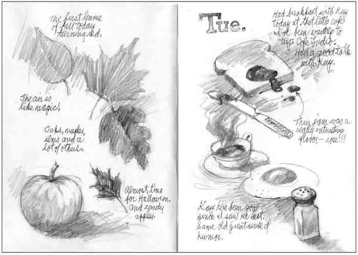
Similar to a movie, most art is rectangular - like these two sample journal pages.
That means the entire area within that rectangle needs to be interesting, not just the star of your art or a few of the objects in it.
And making the space in your art interesting doesn’t have to be a huge task.
In fact, something simple may be all that's needed.
In the journal pages above, all I’ve done is place the subjects on each page in a nice flowing curve.
Then I wrote some captions in key spots to make the background (white) space around my subjects more visually interesting.
I didn’t need to cover every inch of the page with tone. I could have, but this way I didn’t need to.
Notice that I also put pencil tone between many of the objects to create the feeling that some of them aren’t just floating in space.
This not only creates a more interesting background, it also helps emphasize the curve of the design on each page.
Don’t Make This Painting Mistake
The principles I described about drawing are the same that apply to painting.
In this book cover illustration by Glenn Harrington, the little league pitcher is the obvious star.
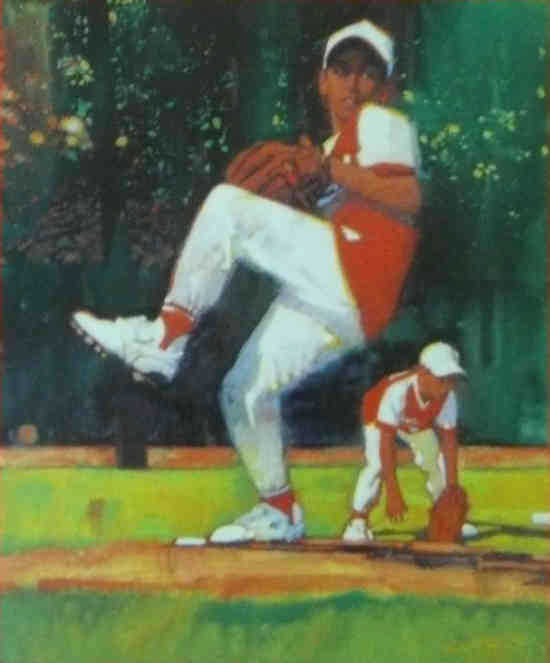
But notice that a large proportion of the art is background.
That background needs to be interesting, but not so interesting that it competes with the star for your attention.
Many beginning artists would have spent a bunch of time delineating all the trees in the background.
Or just painted a flat tone for a background.
Glenn wisely didn’t make this art mistake.
He laid in an oil wash that varied the tone. Then he painted just enough "sky holes", tiny areas of lighter paint that your imagination interprets as light coming through trees.
This is a great example of how to not make the art mistake of creating a large dull area within your art.
And one of the ways to put more emotion and more excitement in your work.
Best Wishes,
Gary Gumble
Founder of BeginningArtist.com
Without art the crudeness of reality would make the world unbearable. (George Bernard Shaw)
P.S. It's often the simple solutions that make all the difference in your art, whether you are drawing or painting.
And consistently creating good art depends on you doing the right simple things over and over...
… until they become an ingrained habit.
That is when art really becomes fun. That is when you can call upon more and more of your creativity.
And wouldn't you like to know more ways to do that?
Copyright Gary Gumble 2023 All rights reserved About Privacy Policy Terms of Use Contact www.beginningartist.com 27 rue Roucher, 34000 Montpellier, France