Throw Away Most Of Your Paints!
Story-telling Art Secret #3 You Absolutely Need to Know

"Throw away most of my paints! Gumble, are you out of your cotton-picking mind? I need all my paints. Everyone knows the more color you use in your work, the better it will be."
Right?
Well, just let me inject a little rhyme into my reply: 100 tubes of paint do not an artist make.
(This is the third in a series of blog posts about the Story-telling Art Secrets You Absolutely Need To Know. Each post reveals a different aspect of telling the most exciting story you can in your art. Click these links to read previous posts about Story-telling Art Secret #1 and Story-telling Art Secret #2.)
I remember a workshop I taught some years ago where one participant brought in a multitude of pastels. Some were in boxes. Some were in bags.
There were so many different colors and shades that she didn't know where to begin. Having such a huge array of choices can be intimidating.
Often it only takes a few colors, used judiciously, to create wonderful art.
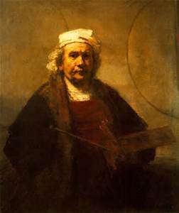
In Rembrandt's day painters had many fewer colors to work with than we do today.
So they learned to use the colors they had to their best advantage.
To produce great work.
And one of the hallmarks of great work is that it has a coherent and cohesive color scheme.
Now that doesn't mean you must only use earth colors like in Rembrandt's self portrait. It doesn't mean you can't use bright colors.
It does mean that the colors you use should work together to create a cohesive whole.
And one way of getting a cohesive color scheme is to decide to use either mostly cool or mostly warm colors in a particular work.
Rembrandt's self portrait it is very warm earth tones.
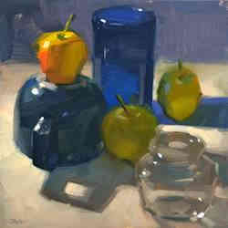
Oregon artist Carol Marine's still life is just the opposite. Here she filled her painting with mostly cool colors and cool grays.
That makes the warm color in the star really stand out.
In my painting "Filipinas" I took it a bit further and not only made the color scheme warm in tone.
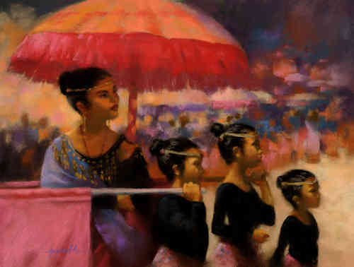
I also confined a good deal of the painting to a specific color range.
Why would I did that?
How does that make the star stand out?
Notice how the three youngest girls with their black leotards sharply contrast with the lighter background.
Yet your eyes are drawn to the older girl holding the umbrella.
Why is that?
Best Wishes,
Gary Gumble
Founder of BeginningArtist.com
Without art the crudeness of reality would make the world unbearable. (George Bernard Shaw)
P.S. A couple weeks ago I began this series of blog posts by telling you to uncover the story you want to tell in your art.
Part of the story you often want to relate is the feeling you have about that subject.
In my painting above, the story I wanted to tell was about the exciting performance of these girls and the rest of their drill team.
Design played an important part in telling that story.
And so did color.
Do you think the colors I used and the way I used them portray that excitement?
Copyright Gary Gumble 2023 All rights reserved About Privacy Policy Terms of Use Contact www.beginningartist.com 27 rue Roucher, 34000 Montpellier, France